Dollar Shave Club
- Jayda Jones

- Feb 3, 2020
- 3 min read
Updated: May 8, 2020
Partial Rebrand


In VCDS III, we did our "Here to There" project. In this project we were free to do whatever we wanted, however it had to show a process or take people from one place to another. So the concept of the project was to go from point A to point B. How we visually accomplished that was entirely up to us. My Here to There project was a stress relief kit for college students. I designed and packaged five items that would hopefully alleviate stress for students like myself. They would go from stressed (here) to relaxed (there).
But now, I am going to revamp this project and turn it into a marketing method. There's a semi small business called the Dollar Shave Club an American company based in Venice, California, that delivers razors and other personal grooming products to customers by mail. It delivers razor blades on a monthly basis and offers additional grooming products for home delivery. It's an affordable alternative to buying expensive razors from the store. A box gets shipped out to you every other month, and it costs about $5.
UPDATE 2/20/20
Shortly after creating this game plan, I had a change in mind and decided to take this project in another direction. For my "Here to There" I have decided to partially rebrand Dollar Shave Club. This means changing the visual appearance of the logo, the products themselves, and the marketing/advertising. What drove me to this decision was the realization that this men's shaving company is also used by women. Many of the facebook ads I see are of women using their shaving products which were designed for men's beards. After doing some research I discovered that 20% of their market is women. And this statistic is from last year. So the numbers are increasing no doubt. It may not be urgent for DSC to rebrand themselves right now, but I saw an opportunity for market expansion, therefore I created a new version of this brand.
CASE STUDY


RESEARCH
Almost daily, I see ads from DSC on Facebook and Instagram advertising their products to women. So I decided to screenshot what I saw just to prove that this company is in fact aware of their female customers, and is starting to make the effort to market towards them. In the ads, they display their $5 Trial box which includes three of their best shaving products: the Prep Scrub, the Shave Butter, and the Post Shave Dew. The kit also comes with a quality razor. Since these are the products that DSC is marketing towards women, these are the products I will rebrand. In addition, I will rebrand (and redesign) a few other products Dollar Shave Club has to offer, because they don't only sell shaving products. They have a line of hair products, shower products, oral care, and skin care.


THE GENDER-NEUTRAL LOOK
In my effort to rebrand this business as a gender-neutral shaving brand, I had to look at different examples of "gender neutral products". In my findings, I noticed that many of the designs were minimalistic and had neutral colors, or non-gendered colors. The lack of detail in the designs prevents them from leaning toward a specific gender. The fonts are also clean and modern. Some are serif and some are san-serif, however I'm certain I will be using san-serif fonts because it seems more appropriate for the price of these products. (serif fonts give the apperance of luxury)


Color Palette
As previously mentioned, gender-neutral products tend to be in the neutral color range, or black/white/gray/dark blue. I've decided to stick with the neutral, and faded color palette.

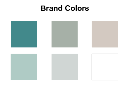
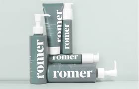
The greenish-blues in the first column are designated to the shaving products, the greenish-grays are for hair products, and the beige and white is for the skin care products. I feel like these colors are suitable for any gender, and they are very earthy/natural. When designing the products I have also thought about what colors would look good in peoples' bathrooms. Many bathrooms follow a nude, or gray color theme.


Some sketches for the bottles and the logo


Before: The tubes had some text inconsistencies and the colors looked very dull. The logo also wasn't that creative and looked a bit misleading. A logo with a money sign in it sends the message that the company is "money hungry".


Before: Social media posts didn't look very eye-catching or even realistic


After: Tubes are more vibrant, they have more contrast and the text discrepancies are corrected. The logo has also been updated.


After: Social media posts look more professional and eye-catching


Comments